# Calculating the average of a list of values

np.mean([5, 4, 6])5.0Open in Google Colab: ![]()
In this section we will learn the basic summaries of data and how to compute them using Python. We will also learn how to visualize data using histograms, box plots, and smoothed density plots.
The arithmetic mean is a measure of central tendency that is calculated as the sum of the values divided by the number of values. It is the most common measure of central tendency and is often referred to simply as the “average”.
For a collection of n values x_1, x_2, \ldots, x_n, the arithmetic mean is calculated as:
\bar{x} = \frac{1}{n} \sum_{i=1}^{n} x_i
Note that this notation is just a short way of writing:
\bar{x} = \frac{x_1 + x_2 + \ldots + x_n}{n}
Example 2.1 (The Arithmetic Mean) For a collection of n = 3 values: x_1 = 5, x_2 = 4, and x_3 = 6, the arithmetic mean is:
\bar{x} = \frac{5 + 4 + 6}{3} = 5
# Calculating the average of a list of values
np.mean([5, 4, 6])5.0Consider a collection of n values x_1, x_2, \ldots, x_n with an arithmetic mean of \bar{x}. For each value, we can define the deviation from the average as x_i - \bar{x}. The sum of these deviations is always zero.
\sum_{i=1}^{n} (x_i - \bar{x}) = 0
Example 2.2 Consider the collection of values x_1 = 5, x_2 = 4, and x_3 = 6 with an arithmetic mean of \bar{x} = 5. The deviations from the average are:
\begin{align*} x_1 - \bar{x} & = 5 - 5 = 0 \\ x_2 - \bar{x} & = 4 - 5 = -1 \\ x_3 - \bar{x} & = 6 - 5 = 1 \end{align*}
The sum of these deviations is:
(5 - 5) + (4 - 5) + (6 - 5) = 0 + (-1) + 1 = 0
# Create a numpy array (you can think of it as a list of values with a couple of special features)
x = np.array([5, 4, 423, 23, 14])

# To print the array, just type its name on the last line of the cell
x
array([ 5, 4, 423, 23, 14])# Pass the values to the np.mean function to calculate the arithmetic average
np.mean(x)93.8# Subtract the mean from each value in the array
# Because this is the last line of the cell, the result will be printed
x - np.mean(x)array([-88.8, -89.8, 329.2, -70.8, -79.8])# Pass the result to the np.sum function to calculate the sum of the differences
# You will get a value of zero because the sum of the differences is always zero
# This is a property of the arithmetic mean
np.sum((x - np.mean(x)))0.0Exercise 2.1 (The Sum of Deviations from the Average) Show that the sum of deviations from the average is always zero for any collection of values.
There are n values x_1, x_2, \ldots, x_n with an arithmetic mean of \bar{x}. The sum of deviations from the average is:
\begin{align*} \sum_{i=1}^{n} (x_i - \bar{x}) & = (x_1 - \bar{x}) + (x_2 - \bar{x}) + \ldots + (x_n - \bar{x}) \\ & = x_1 + x_2 + \ldots + x_n - (\underbrace{\bar{x} + \bar{x} + \ldots + \bar{x}}_{\text{n times}}) \\ & = x_1 + x_2 + \ldots + x_n - n\bar{x} \\ & = \frac{n}{n}(x_1 + x_2 + \ldots + x_n) - n\bar{x} \\ & = n \frac{x_1 + x_2 + \ldots + x_n}{n} - n\bar{x} \\ & = n\bar{x} - n\bar{x} = 0 \end{align*}
As we have seen, it is hard to guess the exact age of a person. In our example we happen to know the age of the persons at the time the images were taken and so we can calculate the error of the guesses. The error is the difference between the guess and the actual age. We can calculate the mean error and the median error.
\text{Guess Error} = \text{Guessed Age} - \text{Actual Age}
The guesses are contained in the Guess column and the actual ages in the Age column. The error is calculated as Guess - Age. We will create a new column in the DataFrame called GuessError to store the errors.
# What was the average guess error in the dataset? First let's calculate the guess error for each row.

dt["GuessError"] = dt["Guess"] - dt["Age"]

# Selects the Guess, Age and GuessError columns and shows the first 5 rows.
dt[['Guess', 'Age', 'GuessError']].head()| Guess | Age | GuessError | |
|---|---|---|---|
| 0 | 58 | 72 | -14 |
| 1 | 70 | 62 | 8 |
| 2 | 57 | 75 | -18 |
| 3 | 19 | 21 | -2 |
| 4 | 30 | 28 | 2 |
# There are multiple ways to calculate the average age of the users in the dataset.
## Using the mean function

np.mean(dt["GuessError"])1.665266106442577## Using the mean method of the column
dt["GuessError"].mean()1.665266106442577# Here we will print the average guess error and round it to two decimal places
print("The average guess errors in the images was", dt["GuessError"].mean().round(2), "years.")The average guess errors in the images was 1.67 years.Example 2.3 (The Average Guess Duration)
dt called GD (short for “Guess Duration”) that contains the time (in seconds) it took for each participant to guess the age of the person in the photo.TimeEnd and TimeStart columns to calculate the guess duration and keep in mind that TimeStart and TimeEnd are measured in milliseconds.# Write your code here and run it
# The TimeEnd and TimeStart contain the time in milliseconds when the user started seeing the image and when they finished.
# To calculate the number of seconds the user spent seeing the image, we need to subtract TimeStart from TimeEnd.
# As both columns are measured in milliseconds, the result will also be in milliseconds.
# We want the new column to be in seconds, so we need to divide the result by 1000.
dt["GD"] = (dt["TimeEnd"] - dt["TimeStart"]) / 1000
# Print out the first few rows of the three columns as a check
dt[["TimeStart", "TimeEnd", "GD"]].head()| TimeStart | TimeEnd | GD | |
|---|---|---|---|
| 0 | 1728456243117 | 1728456250343 | 7.226 |
| 1 | 1728456238837 | 1728456243116 | 4.279 |
| 2 | 1728456228654 | 1728456235495 | 6.841 |
| 3 | 1728456288579 | 1728456295650 | 7.071 |
| 4 | 1728456250345 | 1728456254708 | 4.363 |
# You can also manually check the calculation in the first row by
# just copying the values from the TimeStart and TimeEnd columns and
# dividing by 1000.

(1728456250343 - 1728456243117) / 10007.226For a collection of values x_1, x_2, \ldots, x_n, the median is the middle value when the values are sorted in ascending order. If the number of values is odd, the median is the middle value. If the number of values is even, the median is the average of the two middle values. It is a measure of central tendency that is less sensitive to extreme observations than the mean.
The mode is the value that appears most frequently in a collection of values. A collection of values can have no mode (all values appear equally frequently), one mode, or multiple modes (two or more values appear equally frequently). The mode is generally only useful for categorical data (such as gender, employment status, etc.) and not for continuous data (such as income, speed, duration, etc.).
Example 2.4 (Computing the Median) Let’s compute the median for
(1, 5, 3, 4, 2) .
First, we sort the values in ascending order:
(1, 2, 3, 4, 5) .
Since the number of values is odd (5), the median is the middle value, which is 3. Approximately half of the values are less than the median and Approximately half are greater than the median. In this example 1 and 2 are less than the median and 4 and 5 are greater than the median (so not exactly 50 percent).
Let’s compute the median for
(7, 5, 12, 4, 2, 1.2) .
First, we sort the values in ascending order:
(1.2, 2, 4, 5, 7, 12) .
Since the number of values is 6, therefore even, so the median is the average of the two middle values, which are 4 and 5. Therefore, the median is (4 + 5) / 2 = 4.5. Again, approximately half of the values are less than the median and half are greater than the median.
# The same example as above using the median function from numpy

np.median([1, 5, 3, 4, 2])3.0np.median([1.2, 2, 4, 5, 7, 12])4.5# The median of the guess error
np.median(dt["GuessError"])1.0The median guess error is one year. This means that about half of the errors were less than one year and about half were larger than one year.
Exercise 2.2 (Computing the Median) Compute the median for the following collections of values: z = (2.1, 5, 8, 1, 2, 3) first on a piece of paper and then using Python.
(1, 2, 2.1, 3, 5, 8) .
See if the number of values is odd or even. Since the number of values is 6, the median is the average of the two middle values, which are 2.1 and 3. Therefore, the median is (2.1 + 3) / 2 = 2.55.
# Write your code here and run it

np.median([2.1, 5, 8, 1, 2, 3])2.55Reporting the average of a collection of values is useful, but it only tells a part of the story. We also want to know how different the values in the collection are. One way to measure this is to describe the variation of the data. There are multiple ways to measure the variation of a dataset, here we will start with the percentiles and the range.
The smallest value in the dataset is called the minimum (or the 0th percentile, 0th quartile, or 0th decile).
The largest value in the dataset is called the maximum (or the 100th percentile, 100th quartile, or 100th decile).
The range of the data is the pair of the minimum and the maximum. (Sometime the range is understood as the difference between the maximum and the minimum.)
The span of the data is the difference between the maximum and the minimum.
The difference between the 75th percentile and the 25th percentile is called the interquartile range (IQR) and it is a measure of the spread of the middle 50% of the data.
Instead of four parts (quartiles), we can divide the data into ten parts (deciles) or one hundred parts (percentiles) or into any number of parts (quantiles).
The first decile (D1) is the value below which (approx.) 10% of the data fall.
The second decile (D2) is the value below which (approx.) 20% of the data fall. …
The ninth decile (D9) is the value below which (approx.) 90% of the data fall.
The first percentile (P1) is the value below which (approx.) 1% of the data fall.
The second percentile (P2) is the value below which (approx.) 2% of the data fall. …
The ninetieth percentile (P90) is the value below which (approx.) 90% of the data fall.
The ninety-ninth percentile (P99) is the value below which (approx.) 99% of the data fall.
# We can compute the quartiles of the guesses of the users in the dataset using the quantile method
# and the numpy quantile function.

np.quantile(dt["GuessError"], [0.25, 0.5, 0.75])
array([-3., 1., 7.])The result from the quantile function tells us the values of the three quartiles: (25% or 0.25: Q1 (the first quartile)), (50% or 0.5: Q2 (the second quartile, the median)), and (75% or 0.75: Q3 (the third quartile)).
# Pandas Series (a column of a DataFrame) also have a quantile method.

dt["GuessError"].quantile([0.25, 0.5, 0.75])
0.25 -3.0
0.50 1.0
0.75 7.0
Name: GuessError, dtype: float64# A quick way to get an overview of the data is to use the describe method of a pandas Series (a column of a DataFrame).
dt["GuessError"].describe()count 714.000000
mean 1.665266
std 9.569631
min -29.000000
25% -3.000000
50% 1.000000
75% 7.000000
max 60.000000
Name: GuessError, dtype: float64When working with data it is important to check the extreme values (minimum and maximum). Data collection and programming errors can often be discovered by checking the plausible range of the data. For example, if you are working with a dataset of ages, and you find that the minimum age is -5, then you know that there is an error in the data collection process. Similarly, if you are working with a dataset of heights and you find that the maximum height is 300 cm, then you should examine the data processing steps.
The boxplot is a visualization of the quartiles of a distribution. It shows the minimum and maximum values, the first quartile, the median, and the third quartile. The boxplot is a useful tool for identifying outliers in the data and for comparing distributions.
The boxplot is constructed as follows:
By default, values that are more than 1.5 times the IQR range from the first or third quartile are shown as outliers.
The term “outlier” is often used to describe values that are unusual or unexpected. Outliers can result from errors in the data collection process, from unusual events, or from the natural variability of the data. Identifying outliers is very important because they can help you find errors in your data (perhaps wrong data entry, wrong programming logic, etc.). However, you should never think of outliers as “bad” data, unless you can indeed identify the source of the error. You cannot simply remove outliers from your data without understanding why they are there.
Later on we will see that whether or not an observation looks unusual (an outlier) or not only makes sense in the context of a specific statistical model.
# One way to create a boxplot easily is to use the seaborn library (it is imported as sns at the top of this notebook).

sns.boxplot(data=dt, x="GuessError")
plt.axvline(x=0, color='r', linestyle='--')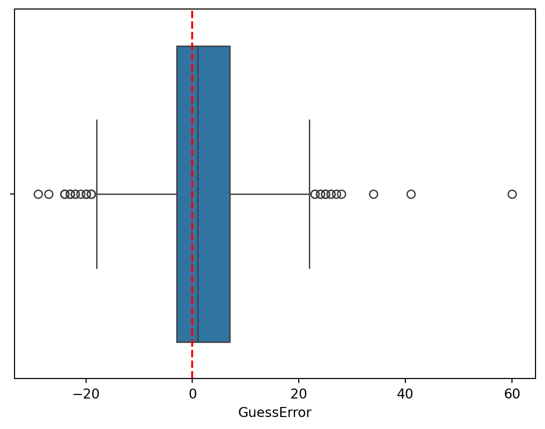
sns.boxplot(data=dt, x="GuessError", y="Gender", hue="Race")
plt.axvline(0, color="red", linestyle="--")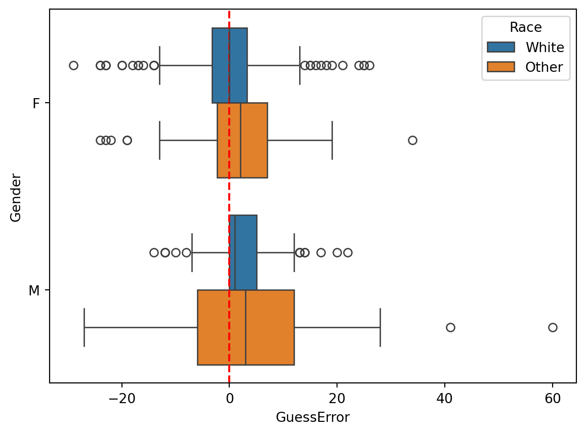
Exercise 2.3 (The Quartiles and the Percentiles) You have already create a column GD (guess duration) in the previous exercise. Now use this column to solve the following tasks:
max method of the new column.)min method of the new column.)quantile method of the new column.)quantile method of the new column.)Gender. Did the participants tend to take longer in guessing the age of males or females?Gender and Race. Did the participants tend to take longer in guessing the age of non-white women?# Write your code here, then compare it with the solution below.# Solution
# 1. To compute the minimum
print("The fastest guess took ", dt["GD"].min(), "seconds.")
# 2. To compute the maximum
print("The slowest guess took ", dt["GD"].max(), "seconds.")The fastest guess took 1.707 seconds.
The slowest guess took 202.204 seconds.# 3. Now compute the quartiles
dt["GD"].quantile([0.25, 0.5, 0.75])0.25 5.26900
0.50 8.32850
0.75 15.63325
Name: GD, dtype: float64About one quarter of the guesses took less than 5.3 seconds (Q1). About three quarters took more than 5.3 seconds. In about half the guesses the users spent less than 8.3 seconds (median) and in about half the guesses the users spended more than 8.3 seconds. The third quartile tells us about the longest guesses. About one quarter of all guesses took more than 15.6 seconds. Respectively, about three quarters took less than 15.6 seconds.
# 4. Here we want to find the 90th percentile (0.9 quantile)

dt["GD"].quantile(0.9)31.921600000000016Its value is 31.9 seconds. This means that about 90% of the guesses took less than 31.9 seconds.
# 5. Here we are looking for the 80th percentile (0.8 quantile)

dt["GD"].quantile(0.8)18.546599999999998Its value is 18.5 seconds, meaning that about 20% of the guesses took longer than 18.5 seconds, and about 80% took less than this.
# 6. Boxplot of the guess duration

sns.boxplot(data=dt, x="GD")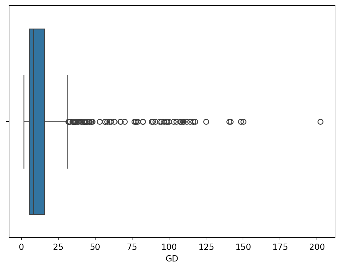
The boxplot depicts the minimum and maximum values, the first quartile, the median, and the third quartile. The whisker on the left side of the box extends to the minimum value. The maximum value is shown as an individual point, as it is classified as an outlier.
# 7. Boxplot of the guess duration by gender

sns.boxplot(data = dt, x = "GD", y = "Gender")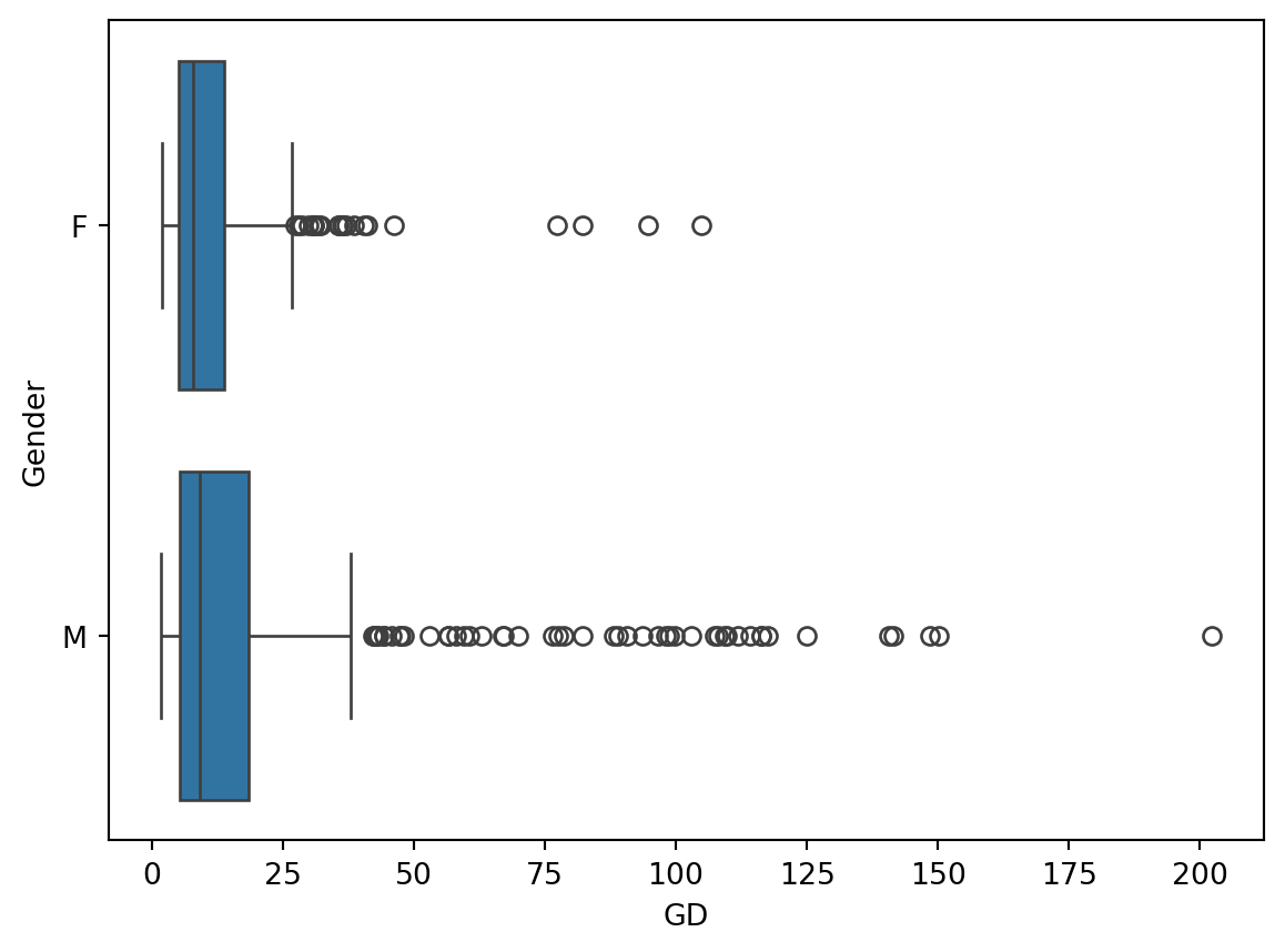
This boxplot shows us the distributions of the guess durations for images with women and with men. The guess durations for men appear to be more dispersed than those for women (judging from the IQR, the whiskers and the outliers). This may indicate that the participants were more uncertain about the age of some of the men and took longer to enter their guesses.
# 8. Boxplot of the guess duration by gender and race

sns.boxplot(data = dt, x = "GD", y ="Gender", hue="Race")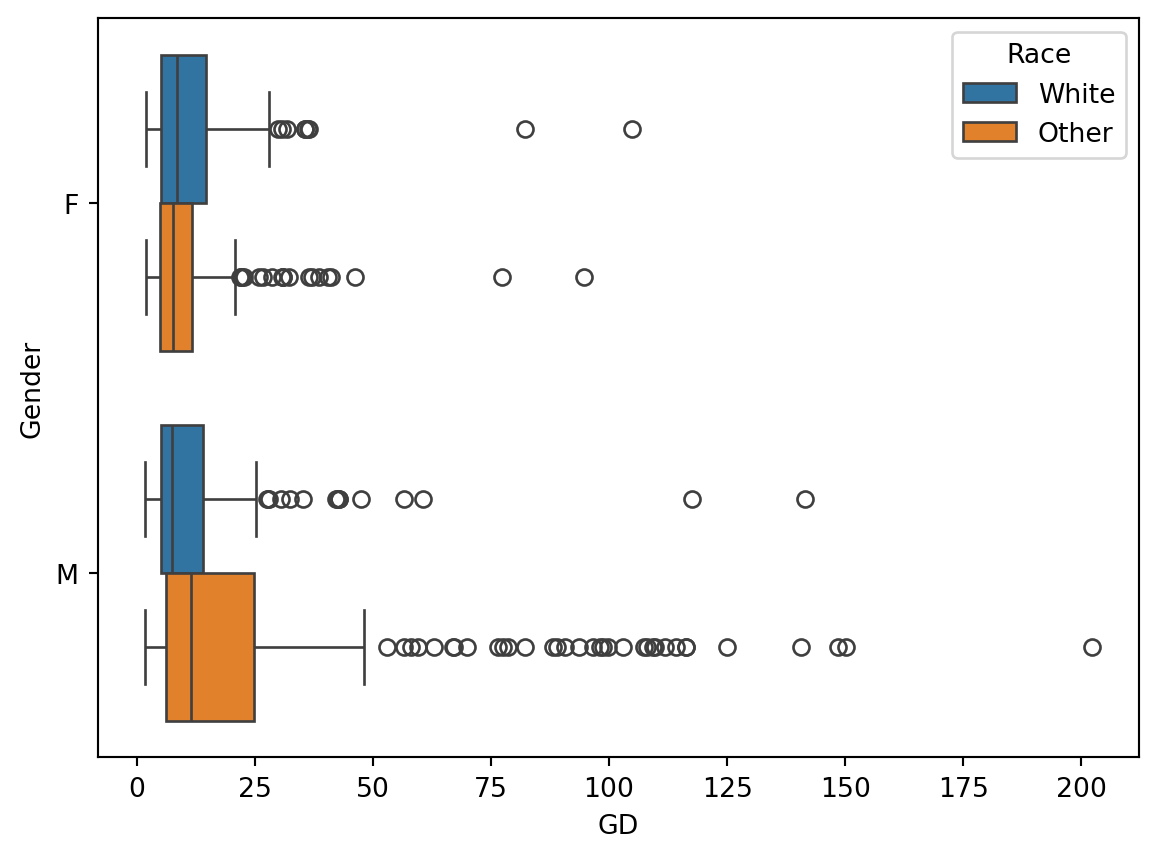
The comparison of the distributions of guess durations by both gender and race shows that the guess durations were most dispersed for non-white men. Furthermore, the median guess duration (line inside the box of the boxplot) was the longest for this group. This may indicate that the participants were more uncertain about guessing the age in this group and took longer to think about their guesses.
You are probably already familiar with bar charts as these are pervasive in the media. Bar charts are commonly used to visualize the frequency (the number of observations) of different categories. The height of the bars represents the frequency of each category.
We can count how many times each value appears in a column using the value_counts method. For example, let’s count the number of guesses for men and women in the dataset.
dt["Gender"].value_counts()Gender
M 378
F 336
Name: count, dtype: int64The result of .value_counts() tells us that the users guessed the age of 378 images of men and 336 images of women. This is what we call a frequency table. A very common visualization of a frequency table is a bar chart. The height (length if it is horizontal as in the example here) of the bars in this figure represent the frequency of each category.
# You can create a bar chart using the countplot function from the seaborn library.

sns.countplot(dt, y = "Gender")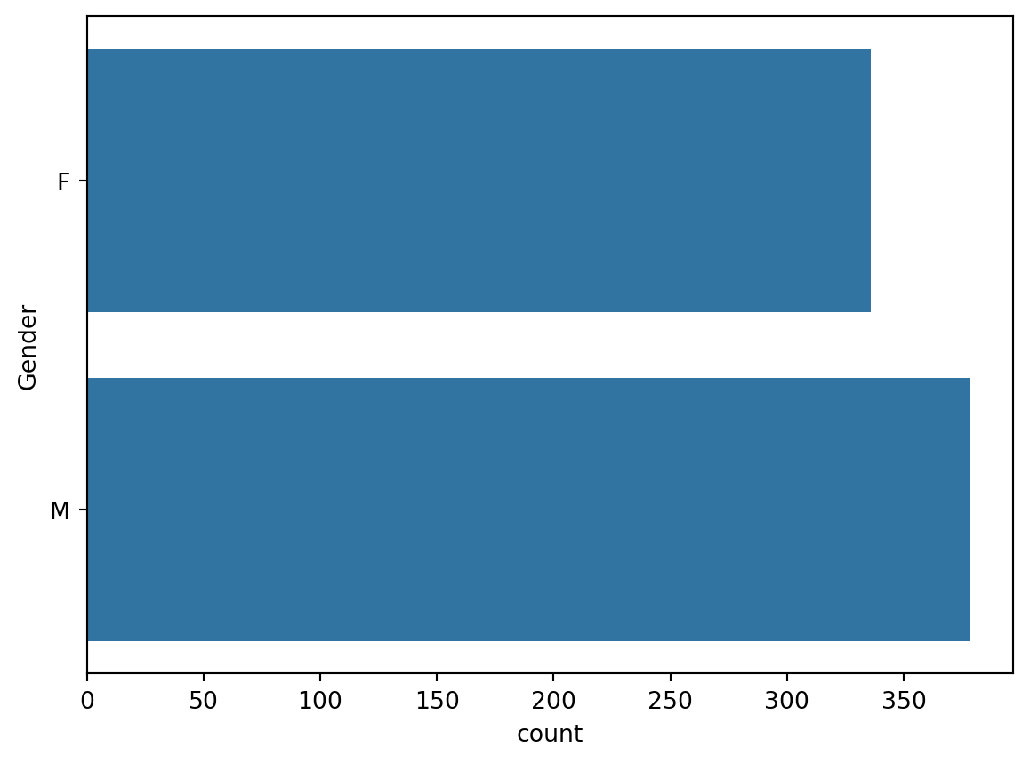
# Exercise: create a frequency table and a bar chart for the Race column

# First the frequency table
dt["Race"].value_counts()
Race
Other 378
White 336
Name: count, dtype: int64# And now the bar chart
sns.countplot(data = dt, y = "Race")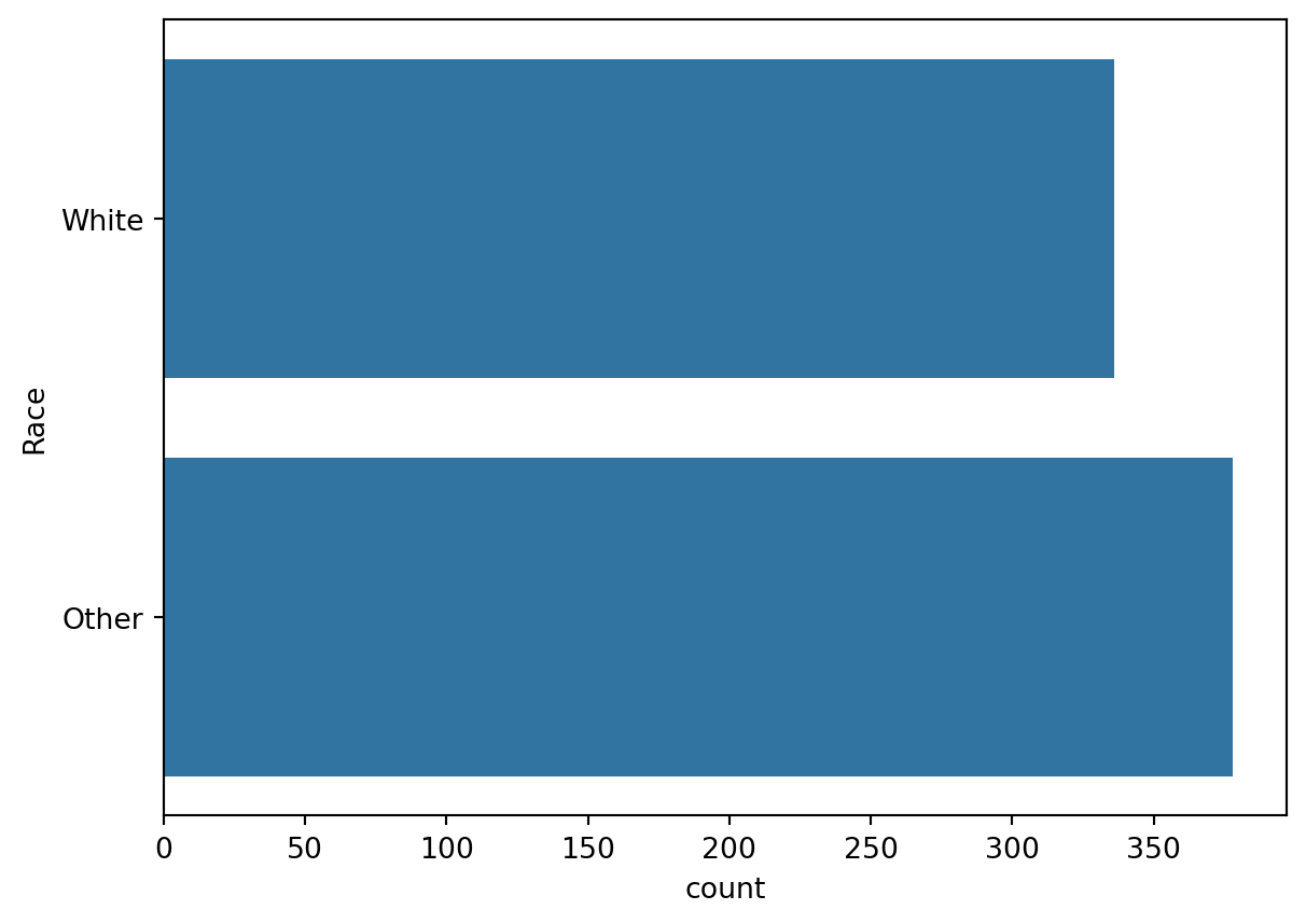
In the previous block we encountered bar charts as a way to visualize the frequency of different categories. The histogram is a similar visualization, but it is used to visualize the distribution of a continuous variable. The problem it solves is that we cannot visualize the frequency of each value of a continuous variable because there are infinitely many values. Instead, we group the values into intervals (bins) and visualize the frequency of each bin. The number of bins is a parameter that can be adjusted to show more or less detail. Usually you will have to experiment with the number of bins to find a reasonable visualization.
# Plot a histogram of the guess errors
import matplotlib.pyplot as plt
import seaborn as sns

# Seaborn histogram

sns.histplot(dt, x = "GuessError", bins=20, alpha=0.1)

# Draws a vertical line at x=0 (no guess error) in green
plt.axvline(x=0, color='green')

# Draws a vertical line at the mean guess error in red
plt.axvline(x=dt["GuessError"].mean(), color='red')

# Set axis labels
plt.xlabel("Guess errors")
plt.ylabel("Count")
Text(0, 0.5, 'Count')
Exercise 2.4 (A Histogram of the Guess Durations)
# Write your code here and run it

sns.histplot(dt, x = "GD", bins=20, alpha=0.1)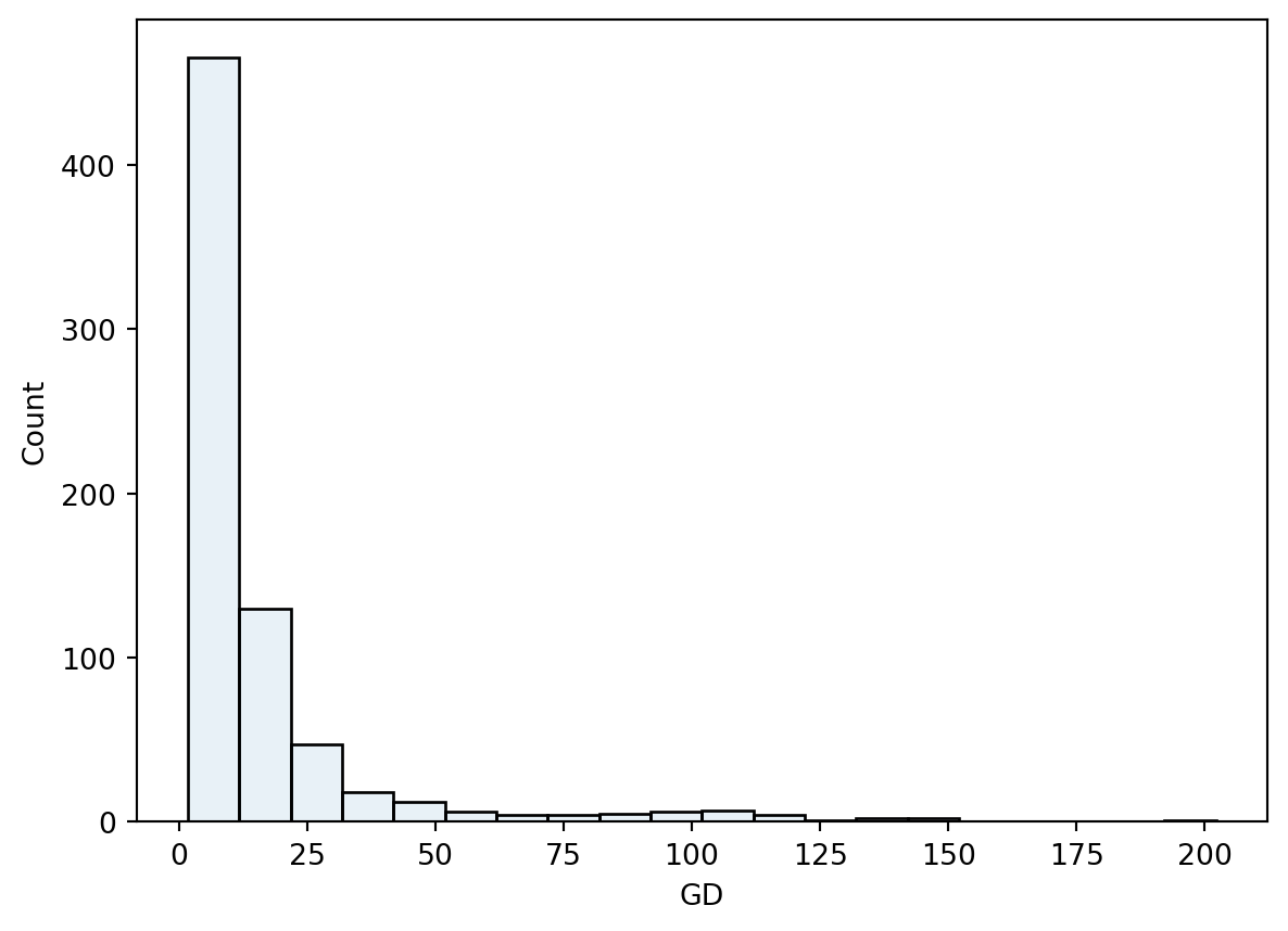
The distribution of the guess durations is not symmetric as was the case of the guess errors. It shows a high number of short guesses and many infrequent long guesses.
The kernel density estimate (KDE) is a smooth version of the histogram. It is a non-parametric method to estimate the probability density function of a continuous random variable (we will talk more about it when we introduce the concept of probability density functions later in the course).
Just like the histogram, the KDE has a parameter that controls the smoothness of the estimate.
sns.kdeplot(data = dt, x = "GuessError", bw_adjust=1)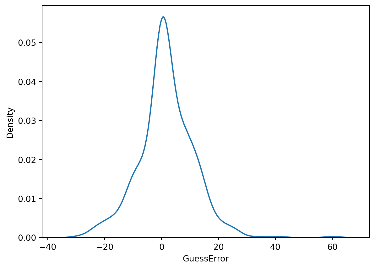
sns.kdeplot(data = dt, x="GuessError", hue="Gender")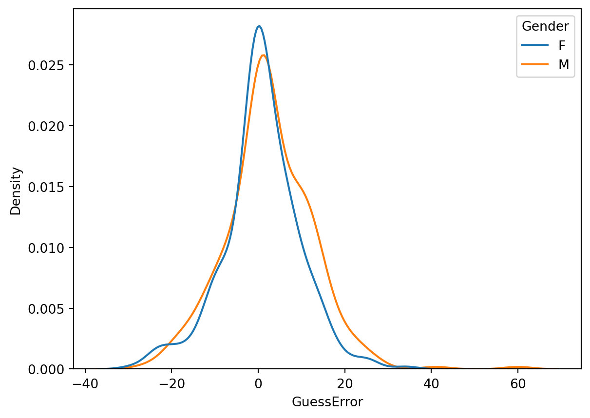
Until now we have discussed the span of the data and the inter-quartile range as measures of variability. Another measure of variability is the variance.
Definition 2.1 (The Sample Variance and Sample Standard Deviation) The variance of a collection of n values x_1, x_2, \ldots, x_n is calculated as the average (with a correction factor) of the squared differences between each value and the mean:
\text{S}^2_{x} = \frac{1}{n - 1} \sum_{i=1}^{n} (x_i - \bar{x})^2
This is a short way of writing:
\text{S}^2_{x} = \frac{(x_1 - \bar{x})^2 + (x_2 - \bar{x})^2 + \ldots + (x_n - \bar{x})^2}{n - 1}
The standard deviation is the square root of the variance:
\text{S}_{x} = \sqrt{\text{S}^2_{x}}
What are the units of measurement of the variance and the standard deviation?
Example 2.5 (Computing the sample variance and the sample standard deviation) Given a set of measurements x = (x_1 = 1, x_2 = 8, x_3 = 3), calculate the sample variance and the sample standard deviation.
Solution. For the set x:
\bar{x} = \frac{1 + 8 + 3}{3} = 4
\text{S}^2_{x} = \frac{(1 - 4)^2 + (8 - 4)^2 + (3 - 4)^2}{3 - 1} = \frac{9 + 16 + 1}{2} = 13
Theorem 2.1 (Sum of Squares formula) The centerpiece of the definition of the sample variance is the sum of squared deviations from the mean. This sum can also be calculated according to the following formula:
\sum_{i = 1}^{n} (x_i - \bar{x})^2 = \sum_{i = 1}^{n} x_i^2 - n \bar{x}^2
Proof. Let’s start with the left hand side of the equation:
\begin{align*} \sum_{i = 1}^{n} (x_i - \bar{x})^2 & = \sum_{i = 1}^{n} (x_i^2 - 2x_i\bar{x} + \bar{x}^2) \\ & = \sum_{i = 1}^{n} x_i^2 - 2\bar{x} \sum_{i = 1}^{n} x_i + n\bar{x}^2 \\ & = \sum_{i = 1}^{n} x_i^2 - 2n\bar{x}^2 + n\bar{x}^2 \\ & = \sum_{i = 1}^{n} x_i^2 - n\bar{x}^2 \end{align*}
# To calculate the variances in Python it is convenient to first store the values into variables

x = [1, 8, 3]

print("x =", x)
x = [1, 8, 3]# Numpy provides functions to calculate the variance and standard deviation of a list of values.
# Computes the variance of the list x. ddof=1 means that the denominator is n-1 of the sum of squared differences is n - 1 (as in the formula above)
np.var(x, ddof=1)13.0# Compute the standard deviations of the list x. The ddof parameter is the same as in the variance function.
np.std(x, ddof=1)3.605551275463989# You can check that the standard deviation is the square root of the variance. np.sqrt computes the square root of its argument.
np.sqrt(np.var(x, ddof=1))3.605551275463989Exercise 2.5 (Computing the sample variance and the sample standard deviation) Given a set of measurements y = (y_1 = 2, y_2 = 7, y_3 = 4)
y and using the mean and std methods of the array.# Write your code here
Exercise 2.6 (The Variance of the Guess Duration) Calculate the sample variance and the sample standard deviation of the guess duration (GD) column.
# Exercise: Calculate the variance of the guess durations. First, use the `.var()` method and then the `np.var()` function and compare the results.